Colour makes life better
Red stands for danger and makes us wide awake. Gold stands for sublimity. Blue stands for calm. These and other effects of colours are well known and are (unfortunately too rarely) also used in office landscape design. The following is true: colours rarely come alone. In interior design, it is almost never single colours, but always complex colour worlds that have an effect on people: the combination of all the colours on floors, walls and ceilings, as well as on furniture, accessories, plants, stands on tables, shelves and so on. And how they work! There are people who attribute a 40 percent (!) influence on the success of thinking and knowledge work to the right colour scheme.


In 2004, the sociologist and psychologist Eva Heller surveyed the effect of colours and summarised individual colours according to the importance they have for a certain effect or association. Around 1,900 people were surveyed at the time. Our PR agency recently tested the results among 140 creative people. The results show that not much has changed over time. The effect of colour worlds and combinations seems surprisingly universal.
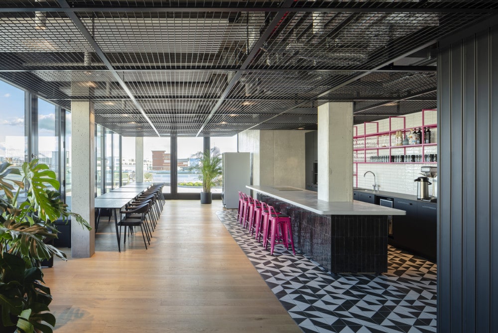
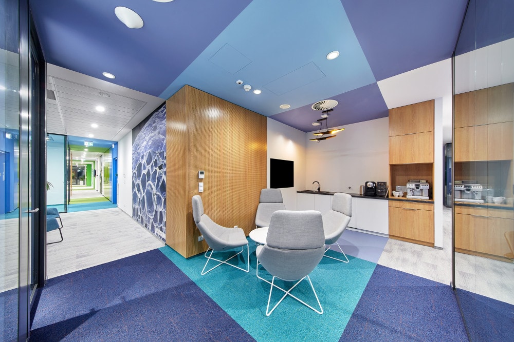
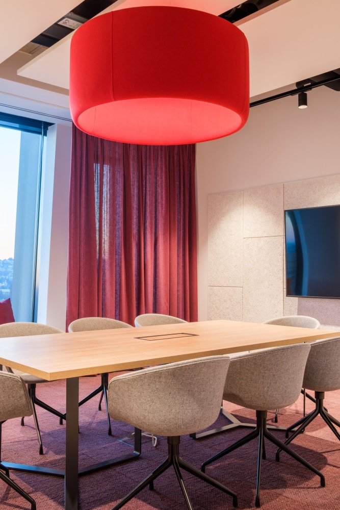
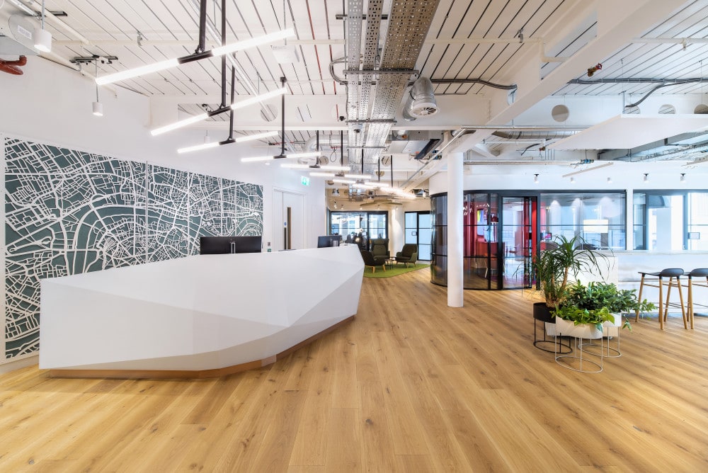
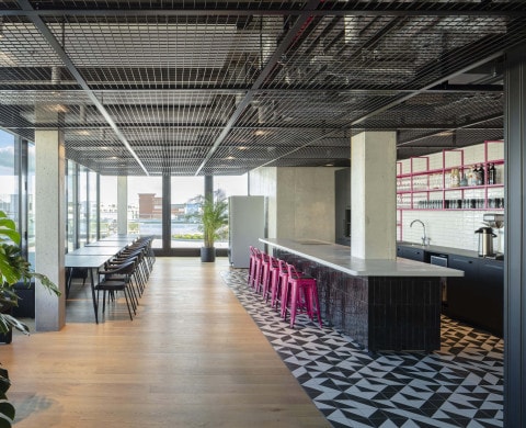
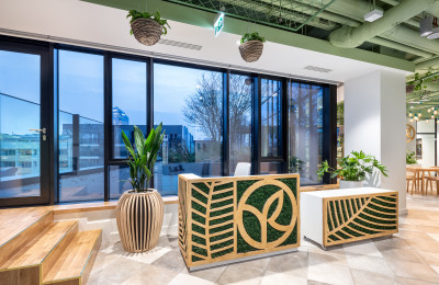
Let’s use this universal power more often when designing office landscapes that support us humans – after all, there are still far too many offices that give away their potential here. Let’s go into more detail with more love and supplement the desired effect, for example, with colour focal points that serve to direct gazes. Or through corporate branding and the corporate culture, which are picked up on selectively in terms of colour. Or we simply let main streams and secondary phases of colour trends flow in as a supplement. As a result, style plurality is increasing among the, as I said, unfortunately still too few colourful spaces. Below are some office landscapes that we have realised in various countries.
